A community platform for addiction recovery — designed with the sensitivity and craft the subject deserves
The Challenge
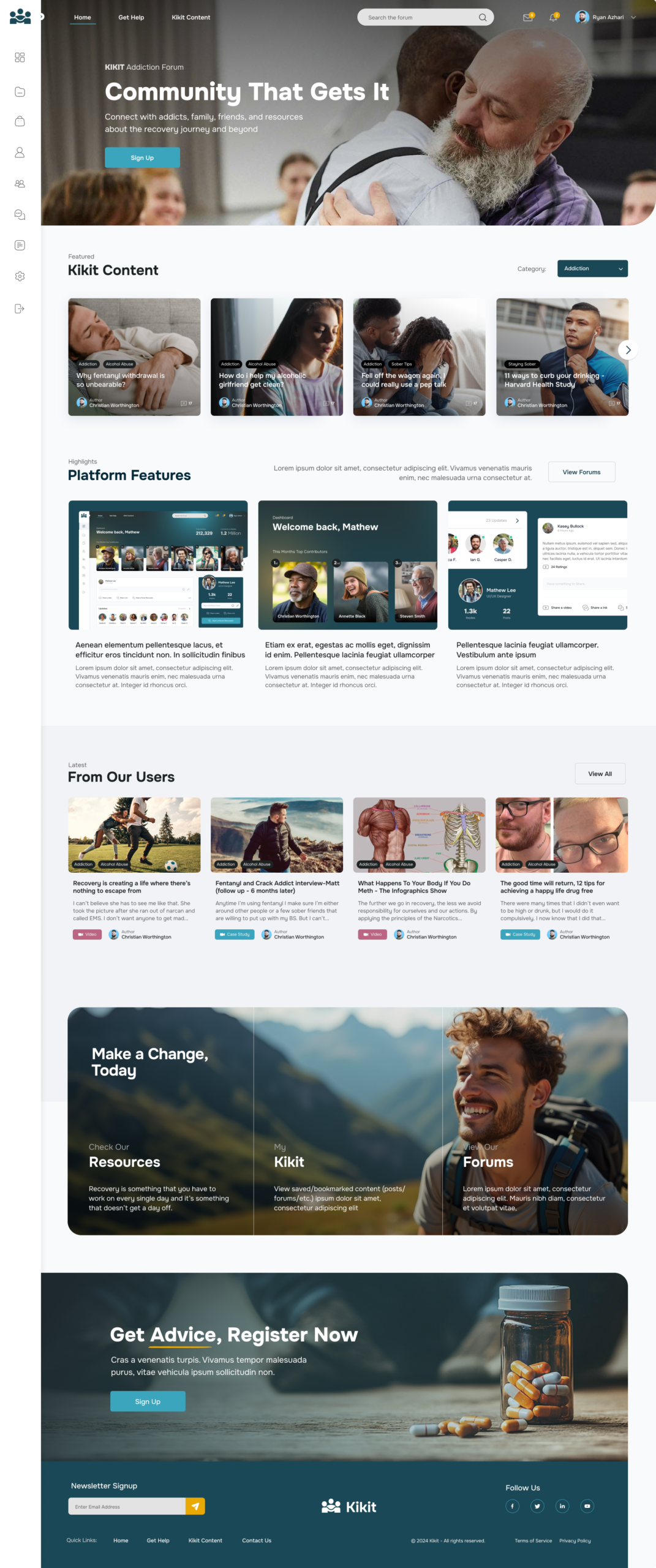
Kikit is an online community platform built for people navigating addiction and recovery — connecting users with others who have lived experience, curated content, peer forums, groups and resources. The tagline says it all: Community That Gets It. This is a platform for people at some of the hardest moments of their lives, and every design decision needed to reflect that.
The brief was to design a full community platform from scratch — a social feed, personalised dashboard, forums, article library, group events, messaging and a resources section — all wrapped in a UI that felt warm, trustworthy and human rather than clinical or corporate. Users needed to feel welcomed, not processed. The audience spans people in active recovery, their families and friends, and professionals — all with very different needs and emotional starting points.
What We Delivered
This is one of the most considered pieces of UI work in the portfolio and one I’m genuinely proud of. Getting the tone right was everything — too cold and it feels like a health app, too casual and it undermines the seriousness of what people are going through.
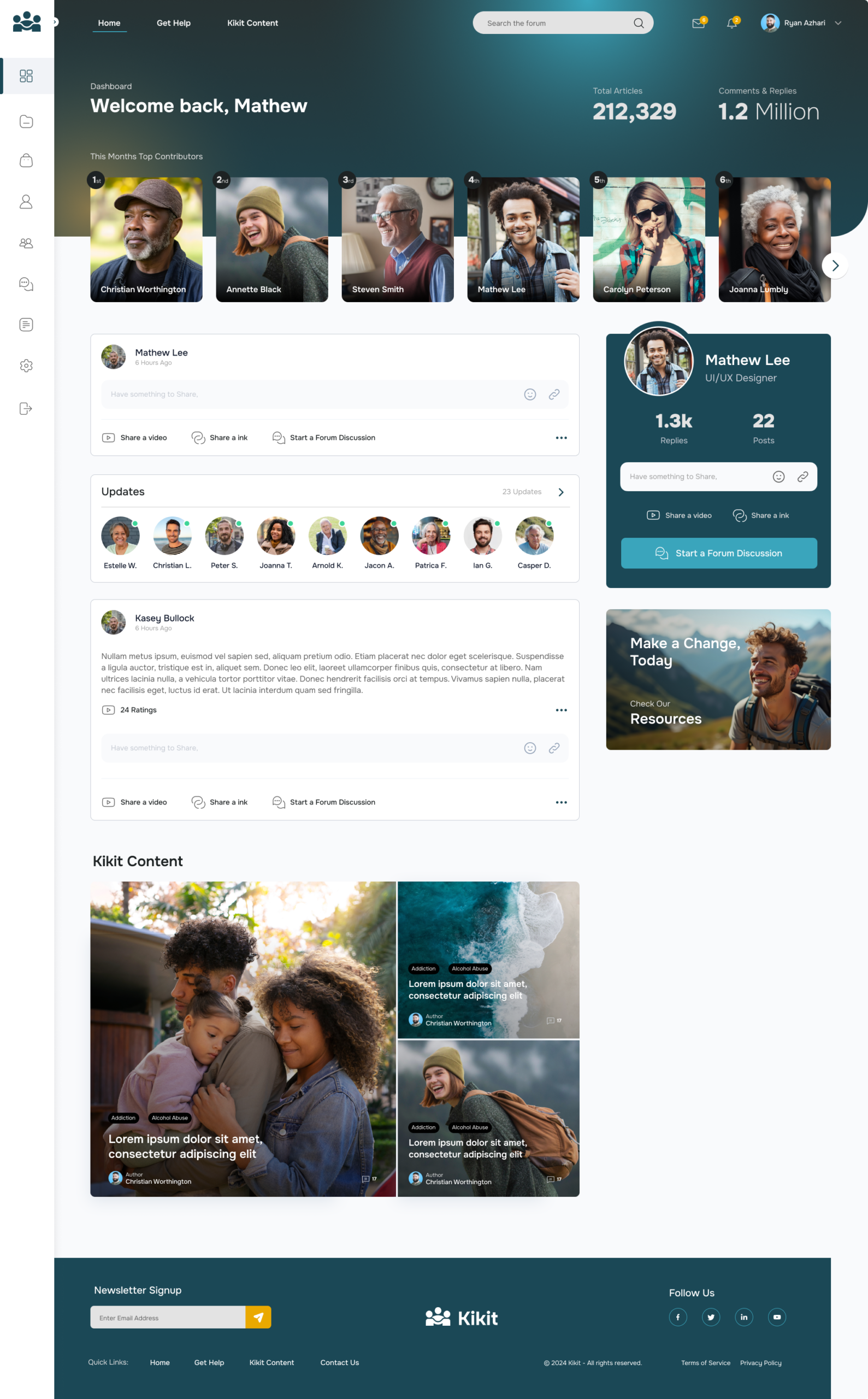
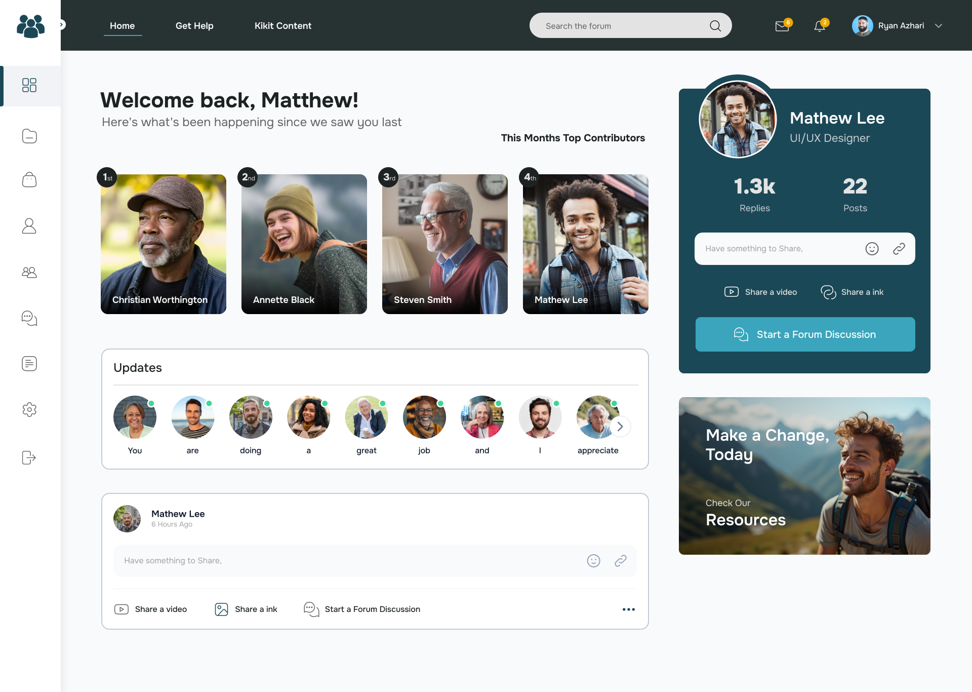
Working through multiple iterations in Figma, I designed a full platform UI built around warmth and clarity. The hero leads with real faces — a diverse mosaic of people that immediately communicates belonging. The teal and dark colour palette is calm and grounded without feeling medical. Typography is confident and clear, never overwhelming. The dashboard gives returning users an instant sense of community — top contributors, activity feeds, personal stats — while keeping the path to content and connection frictionless.
The feed, forum and article components were designed to scale across 12,000+ articles and 1.2 million comments while still feeling personal. The profile card, post interactions and group invitation patterns all went through multiple rounds to get the micro-interactions right. Early versions went through significant iteration — the designs show the evolution from a more compact dark UI through to the final open, light and welcoming result.
A platform that meets people where they are. We think it does the job with care.