My own website, the one where I got to break all the rules I normally follow for clients
The Concept & Design
Every designer’s personal site is a chance to push things further than a client brief would normally allow. This one started with a single idea that wouldn’t leave me alone — what if a website felt like a native Apple app rather than a web page?
The concept came from studying native iOS UI patterns and the way Apple’s own interfaces use the device frame as part of the composition — elements bleeding to the edge, containers that feel physically anchored to the screen rather than floating inside a browser window. I wanted that same sense of physicality on a website.
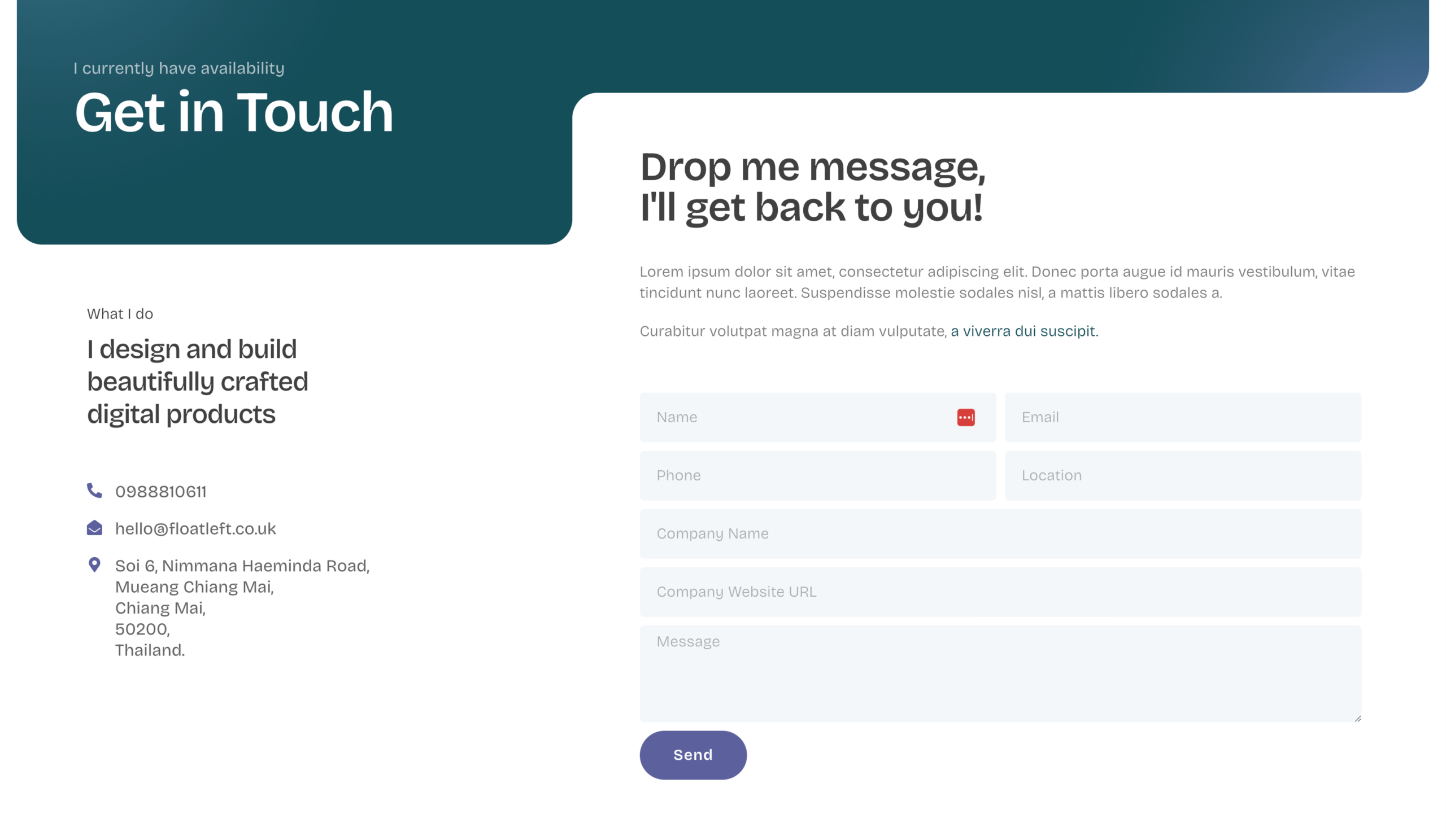
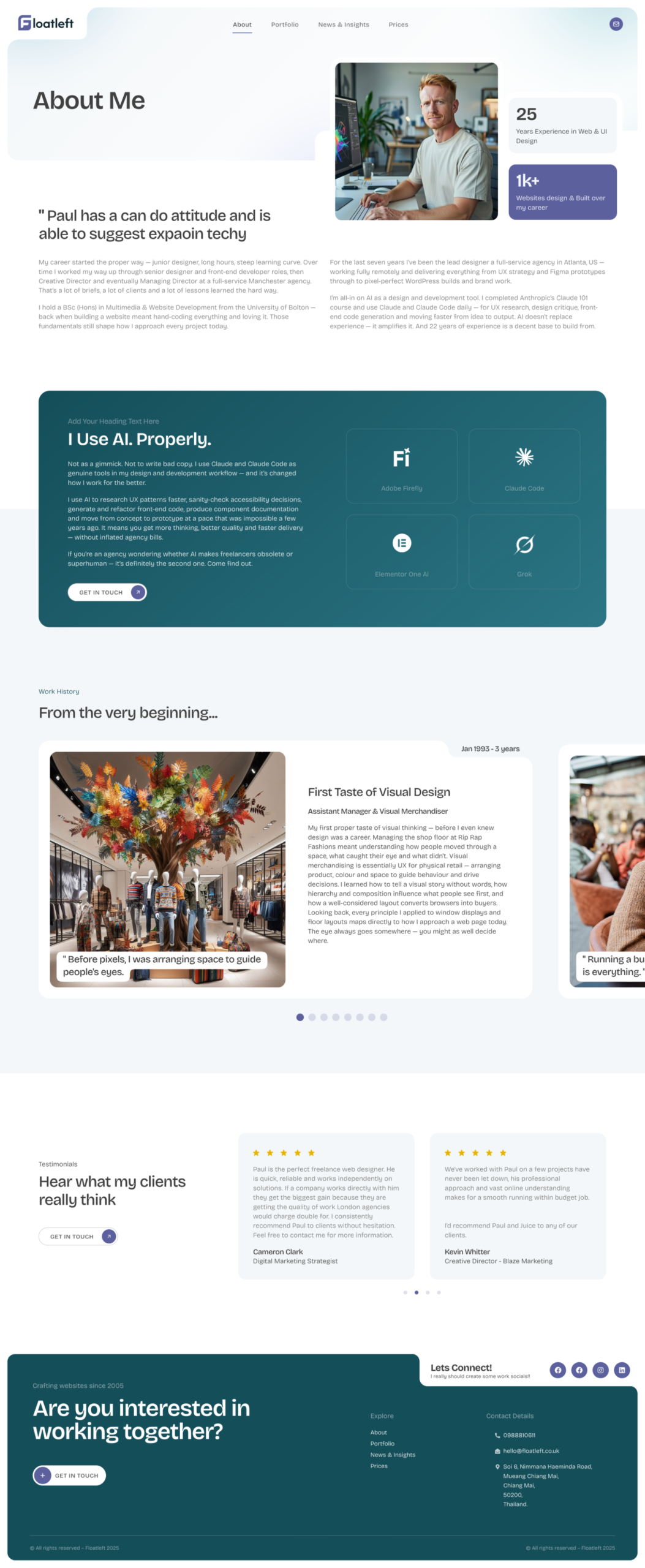
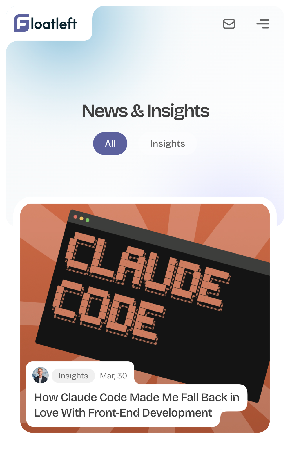
That idea drove every design decision in Figma. I went deep on rounded border radii — proper large-radius rounded corners throughout — but the thing I was really excited about was inner radius borders. When you round a container and then place a rounded element inside it, the inner element’s corner radius needs to match the spatial relationship with its parent — too tight and it looks wrong, too loose and the geometry breaks. Getting those inner radii right was one of the more obsessive parts of the Figma process and one of the details I’m most pleased with on the finished site.
The colour palette — dark teal, near-black, off-white and purple accent — was chosen to feel premium and considered without tipping into the generic “dark mode SaaS” look. The result is something that sits closer to an iOS settings panel or a native app dashboard than a traditional portfolio site.
The Build
The build was from scratch on the Hello theme with Elementor Pro — no theme kits, no pre-built templates, minimal plugins. Every section, every layout, every component was built by hand to keep the codebase lean, fast and maintainable. Clean output was the goal throughout.
All the Figma pages were translated into Elementor meticulously — making heavy use of WordPress Loop items to power the portfolio grid and post templates so everything stays dynamic and easy to update without touching code.
The technical detail I’m most pleased with is the gooey SVG filter effect used across the site for the organic rounded blobs and merged shapes. After researching CSS filter techniques I landed on an SVG feGaussianBlur and feColorMatrix filter combination — the classic gooey filter trick — which creates those soft, fluid merging shapes that would be impossible to achieve with standard CSS border-radius alone. It’s the kind of thing that’s invisible to most visitors but gives the site its character.
The result is a site that moves and feels like a native product — responsive across all breakpoints, fast despite the visual richness, and genuinely different from anything I’ve seen built in Elementor before. It’s the project where I proved to myself that the constraint of a page builder doesn’t have to mean compromise.